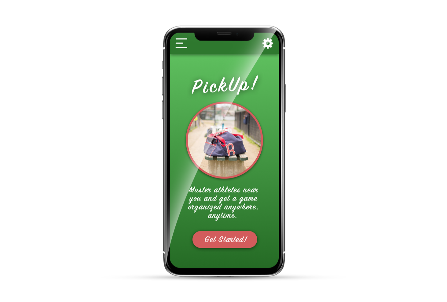
Athletics App
User Research | UX Design | UI Design | Prototyping
I was part of a group that set out to explore creating a tool to be used by high school students attempting to be recruited for college sports. After conducting interviews, creating user journeys, and performing competitor research, myself and a team were able to identify an opportunity for sports enthusiasts everywhere.
Step 1: Research
Interviewing | Observation | Exploration
Interview participants were scheduled for two on one meetings, one designer taking notes and the other conducting the interview. After thirty minute interviews, the information was placed on post-its and arranged on affinity boards to allow for visual organization. The interviews included not just their experience in high school sports and recruitment, but who they are as a person, what they do in their free time, goals, environment, and insecurities.
Interview focuses:
- User background
- Relationship with technology in general
- The tools and methods currently used
- The user’s main objectives and motivations
- The user’s pain points
Step 2: Analysis
Affinity Boards | User Personas | User Flows
We identified potential touch-points and features that we would explore further. Users reacted strongly to, and emphasized the importance of socializing, practicing whenever possible, and having unpredictable schedule changes. Based on that we focused on a feature allowing them to coordinate spur of the moment games.
Step 3: Wireframes
Paper | Sketch | Photoshop
Paper and pen wireframes were used to quickly create and share designs. Assets were designed to mimic existing patterns in hopes that first-time users would be able to intuitively use the interface.
Step 4: Low Fidelity Prototypes
Sketch | InVision
Using the paper wireframes as reference, a low fidelity prototype was made using Sketch and InVision. Users were observed navigating through the app with careful attention paid to their ability to navigate it without aid or influence.
Step 5: High Fidelity
Sketch | InVision | Photoshop | Illustrator
The prototypes were converted to high fidelity with branding and styles used that would be both familiar and fun. The interaction and navigation were modeled off of existing patterns seen in popular apps and allow users jump in with very little orientation necessary.
We also identified some core values that we agreed are essential:
- Clarity: The user should be able to pick up the product and be able to use it with very little onboarding. It's purpose should be clear and intuitive.
- Delightful: It is non-negotiable that this should be a source of joy for all users. Sports are fun, spur of the moment games are fun, and the product should be fun.
- Accessible: The design should include large and easy to use buttons. Are the users all athletes? Maybe? But do we want a wide range of people to be able to pick it up and go? Absolutely!
Step 6: Test and Reiterate
The idea behind PickUp was to lower the activation energy required to practice a user's sport, neither planning nor established teammates are needed. This may also be attractive to the general public and make use of unoccupied sports fields and the odd free hour in people's schedules.
The next steps are to test, reiterate, and repeat.


